
Burnout costs employers an estimated $125–$190 billion in healthcare spending every year — yet the average profitability report has no field for it (Harvard Business Review, widely cited). Managers track project margin, utilization rates, and revenue per employee — all backward-looking metrics. None of them detect whether the team generating those numbers is four weeks from a breaking point.
This article shows exactly what profitability reports miss, what Predictive Burnout Analysis reveals instead, and how the two layers work together to give leadership a complete picture of team health.
What Profitability Reports Actually Measure (And What They Don’t)
Profitability reports measure revenue, cost, and margin — three numbers that tell you what happened, not what’s about to. They’re designed for financial accountability: did the project come in under budget? Did this client relationship generate a positive return? Did the team’s billable hours justify the salary line? These are legitimate questions. They’re just not the only questions that matter.
Standard profitability metrics rest on a set of assumptions that feel reasonable until you stress-test them. Hours worked equals hours of productive output. Labor cost equals labor input. Margin equals team sustainability. Each of these assumptions breaks down under sustained pressure.
The real gap: Most managers treat burnout as a feelings problem — diagnosed by HR after the fact, through exit interviews. That’s the wrong frame. Burnout has measurable, leading indicators: context switches per hour, after-hours login frequency, idle-to-active ratios, focus session length. These signals appear in time tracking data weeks before the employee disengages or resigns. The data is already there. The question is whether your tools surface it.
The financial cost of missing these signals is well-documented. Burned-out employees are 63% more likely to take a sick day and 2.6× more likely to be actively looking for a different job (Gallup State of the Global Workplace, 2024). Financial dashboards describe the output of the system. Burnout analytics describe the system producing it.
Burned-out employees are 63% more likely to take a sick day and 2.6× more likely to be actively searching for a new job, according to Gallup’s State of the Global Workplace report (2024). These are measurable attrition risks — yet no financial report includes a field for burnout-driven departure probability.
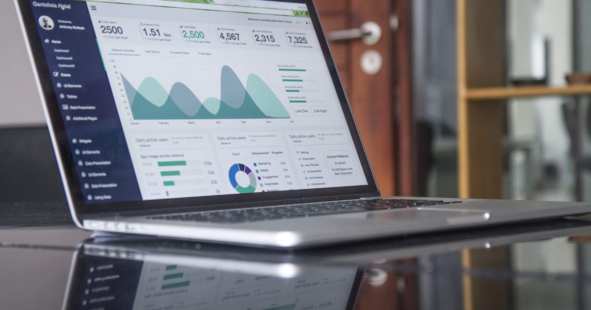
What Is Predictive Burnout Analysis?
Predictive Burnout Analysis is a set of leading indicators derived from time tracking and activity monitoring data — measuring not just how many hours employees work, but how sustainably they work them. It’s forward-looking by design: the signals it tracks appear weeks before disengagement or resignation shows up in any output metric.
77% of workers have experienced burnout at their current job (Deloitte Workplace Burnout Survey, 2023). That figure has stayed stubbornly high across industries and work models, suggesting the problem isn’t individual — it’s structural. The work itself, and the way it’s organized, creates conditions that erode performance over time. Predictive Burnout Analysis makes that erosion visible before it becomes irreversible.
TraqNext’s Predictive Burnout Analysis from multiple aspects surfaces this picture through four analytical dimensions:
Context-Switching Fatigue Index measures how frequently employees shift between tasks, apps, or projects within a given work period. High switching frequency is a direct signal of cognitive fragmentation — the kind that erodes decision quality and deep work capacity without leaving a trace in any time log.
Digital Exhaustion Score is a composite 1–100 indicator that aggregates screen time intensity, active app count, after-hours device activity, and missed break patterns into a single fatigue signal. A score climbing toward red doesn’t require a manager to notice dark circles or a short temper — it surfaces in the data automatically.
Focus vs. Fatigue Trend Tracks work hours, activity levels, and productivity patterns. Reveals inefficiencies and early signs of disengagement.
Work-Life Balance Heatmap visualizes when employees are actually working — including evenings, weekends, and holiday periods. Chronic after-hours patterns that profitability reports count as billable hours are here exposed as boundary erosion in progress.
77% of workers have experienced burnout at their current job, according to the Deloitte Workplace Burnout Survey (2023). Predictive Burnout Analysis surfaces the behavioral signals — task-switching frequency, after-hours logins, declining focus session length — that precede disengagement by weeks, giving managers time to intervene before the cost becomes irreversible.
Why Doesn’t Your Profitability Report Show Context-Switching Costs?
The average knowledge worker switches tasks every 3 minutes and 5 seconds — and it takes an average of 23 minutes to return to full focus after each interruption (Gloria Mark, UC Irvine, 2023). Run those numbers for an eight-hour workday and the math becomes alarming: if an employee is interrupted a dozen times, they may never reach a genuine state of deep focus at all.
The profitability report doesn’t see any of this. It sees eight billable hours and a completed task list. What it can’t see is that four of those hours were spent in low-quality, context-fragmented work that drained cognitive reserves without producing proportional output.
The Context-Switching Fatigue Index makes that fragmentation measurable. It tracks the frequency of task transitions per hour, app-switching patterns across the workday, and the ratio of meeting time to uninterrupted focus blocks. A developer averaging 18 task switches per hour is working differently — and less sustainably — than one averaging four, even if their time logs look identical.
This matters at scale. One team member in constant-switch mode is a workload problem. A whole team living in that state is an attrition event in progress. The cost of interruptions to the US economy alone is estimated at $650 billion per year (Basex Research, cited in multiple workforce studies) — a number that profitability reports, by design, cannot capture or attribute.
The average knowledge worker switches tasks every 3 minutes and 5 seconds, and it takes 23 minutes to fully regain focus after each interruption, according to research by Gloria Mark at UC Irvine (2023). The Context-Switching Fatigue Index quantifies this fragmentation in team-level data — something no profitability or time-budget report currently tracks.
What Is Digital Exhaustion — Why Does It Precede Every Resignation?
Digital exhaustion — measured through after-hours activity, screen intensity, and app overload — appears in the data before employee disengagement becomes visible in output or attitude. By the time a manager notices a team member seems checked out, the Digital Exhaustion Score has usually been in warning territory for over a month.
The Digital Exhaustion Score aggregates what utilization rates miss: hours at screen (not just hours logged), the number of active applications cycling through a workday, after-hours login frequency, and missed break patterns. These inputs combine into a composite 1–100 indicator.
Why do managers miss this? Because they’re measuring utilization — are hours being logged? — rather than intensity — what are those hours costing the person working them? The two numbers can look identical on a timesheet while telling completely different stories about workforce sustainability.
Remote work amplifies the risk. Remote employees report 43% more difficulty unplugging from work than in-office counterparts (Buffer State of Remote Work, 2023). Without a commute to mark the end of the day, the boundary between work and recovery erodes gradually. The Digital Exhaustion Score is often the first place that erosion becomes visible. Remote workers log an average of 1.4 more days per month than in-office employees, adding up to 16.8 extra days per year (Airtasker, cited in remote work research, 2022–2023).
TraqNext’s activity monitoring feeds directly into the Digital Exhaustion Score — capturing app usage patterns, working time, and after-hours activity without requiring employees to self-report anything.
Remote employees report 43% more difficulty unplugging from work than in-office counterparts, and work an average of 16.8 extra days per year — according to Buffer’s State of Remote Work (2023) and Airtasker research. The Digital Exhaustion Score tracks these patterns automatically, surfacing burnout risk weeks before disengagement becomes visible to managers.
How Does the Focus vs. Fatigue Trend Reveal Productivity Decline?
Here’s what the data consistently shows. Productivity doesn’t collapse — it erodes. The Focus vs. Fatigue Trend tracks the gradual shift from sustained deep work to fragmented, low-output sessions over weeks. That shift is measurable. It’s also almost entirely invisible to any financial reporting tool.
39% of employees cite unmanageable workload as the number-one cause of burnout (Asana Anatomy of Work Index, 2024). But unmanageable workload rarely announces itself. It accumulates. A team that ran smoothly at 35 productive hours per week starts slipping to 28, then 22. Fatigue erodes the quality and depth of each session before hours logged even change. The hours logged don’t change. The output starts to degrade.
What declining focus looks like in data: shorter app session lengths, more idle-time interruptions, rising break frequency without corresponding recovery. An employee taking five breaks in a morning isn’t being lazy — they’re running on a depleted cognitive reserve. That pattern appears in TraqNext’s insights and reporting weeks before it shows up in missed deadlines or client complaints.
The performance cliff is real — and it’s sudden. Teams don’t fail quarterly targets gradually. They maintain appearances until a trigger event forces the issue: a key resignation, a missed client deliverable, a team conflict that wouldn’t have escalated six months earlier. The Focus vs. Fatigue Trend gives managers a window to intervene at week six of declining focus rather than week twelve of failed delivery.
39% of employees identify unmanageable workload as the primary driver of burnout, according to the Asana Anatomy of Work Index (2024). The Focus vs. Fatigue Trend surfaces this overload in time tracking data — tracking declining focus session length and rising fragmentation before the workload problem becomes a performance problem or a resignation.
What Does the Work-Life Balance Heatmap Reveal That Reports Can’t?
The Work-Life Balance Heatmap visualizes exactly when employees are working — including after working hours and weekends — revealing chronic boundary erosion that profitability reports treat as billable hours. What cost reports treat as utilization, the heatmap exposes as unsustainable pressure.
That said, the alarm pattern is specific and recognizable once you know what to look for: consistent activity after 9 PM, Sunday afternoon logins, work sessions during national holidays, short gaps between end-of-day activity and next-morning start times. Individually, any one of these might be an exception. As a weekly pattern, they signal an employee with no genuine separation between work and recovery.
This is a leadership failure as much as an individual one. Organizations that normalize after-hours availability — through late Slack messages, weekend emails, or implicit expectations around response time — create the structural conditions for burnout without ever intending to. The heatmap makes that pattern visible at the team level, where leadership can actually act on it.
The cost of ignoring it is quantifiable. Replacing a mid-senior employee costs 50–200% of their annual salary (SHRM, research cited). At a $120,000 salary, that’s $60,000–$240,000 in recruitment, onboarding, and lost productivity — per resignation. A team with three burned-out mid-senior employees represents a potential $180,000–$720,000 liability that no profitability report will flag before the resignations arrive.
Replacing a mid-senior employee costs 50–200% of their annual salary, according to SHRM research. The Work-Life Balance Heatmap identifies after-hours and weekend work patterns at the individual and team level — giving managers a measurable, early warning of the retention risk that profitability reports cannot detect.

Profitability + Predictive Burnout Analysis — The Complete Picture
Neither metric works alone. Profitability reports without burnout analytics create teams that hit targets and quietly fall apart. Burnout analytics without profitability context lose the business case for intervention. Together, they give leadership what neither metric alone delivers: a clear picture of whether the team is performing sustainably.
Consider what this means in practice. Financial health and workforce health are not competing priorities — they’re interdependent. A team that generates strong margins this quarter while burning through human capital is borrowing against future performance. The revenue report shows the loan. Burnout analytics show the interest rate.
What each report actually shows:
| Metric | Profitability Report | Predictive Burnout Analysis |
|---|---|---|
| Revenue per project | ✅ | ❌ |
| Labor cost | ✅ | ❌ |
| Overtime strain | ❌ | ✅ |
| After-hours patterns | ❌ | ✅ |
| Task-switching load | ❌ | ✅ |
| Attrition risk signals | ❌ | ✅ |
| Focus quality over time | ❌ | ✅ |
| Employee wellbeing trajectory | ❌ | ✅ |
The practical workflow that high-performing teams use: run profitability review monthly. Run burnout signal review weekly. When the Predictive Burnout Analysis flags an anomaly — an employee’s Digital Exhaustion Score crossing 70, a team’s Context-Switching Fatigue Index spiking, a consistent pattern of 10 PM logins — that’s the trigger for investigation, not assumption.
TraqNext’s anomaly detection flags unusual work patterns automatically, so managers don’t need to review every individual’s data manually. The signal surfaces—and they act.
Our observation: In teams analyzed using TraqNext, employees with elevated Context-Switching Fatigue Index scores showed measurable productivity decline 3–4 weeks before it surfaced in project delivery metrics. The burnout signal was in the data. The delivery miss came later. That gap is the intervention window — and it only exists if you’re measuring the right things.
As a result, the business case is clear. Preventing one senior engineer’s burnout-driven resignation — at a $150,000 replacement cost — justifies the cost of a full workforce intelligence platform many times over. The question isn’t whether workload management analytics pay for themselves. It’s whether your current tools give you enough visibility to act before the cost arrives.
The cost of workplace interruptions is estimated at $650 billion per year in the United States alone (Basex Research, cited in multiple workforce studies). Combined with Gloria Mark’s finding that it takes 23 minutes to recover full focus after each interruption, the business case for reducing context-switching — and measuring it via the Context-Switching Fatigue Index — is substantial and quantifiable.
Frequently Asked Questions
Can you actually predict employee burnout before it happens?
Yes — with the right data layer. Predictive Burnout Analysis tracks leading behavioral indicators (context-switching frequency, after-hours activity, declining focus session length) that appear in time and activity data weeks before an employee disengages or resigns. These signals don’t require surveys or self-reporting — they surface automatically from tracked work patterns. Research by Gloria Mark at UC Irvine confirms that work fragmentation and recovery deficits are measurable long before output declines.
What is a Context-Switching Fatigue Index?
The Context-Switching Fatigue Index measures how frequently an employee shifts between tasks, apps, or projects within a given time period. High switching frequency correlates with cognitive overload, reduced decision quality, and longer recovery time. The average knowledge worker switches tasks every 3 minutes and 5 seconds — and it takes 23 minutes to return to full focus after each interruption (Gloria Mark, UC Irvine, 2023). The index makes this team-wide fragmentation visible in a single metric.
What is a Digital Exhaustion Score?
A unified 1–100 risk score combining missed breaks, app usage intensity, and weekend work. Color-coded from green (healthy) to red (high risk), it gives managers one number to act on — a workload health gauge, not a performance judgment.
Why don’t profitability reports flag burnout risk?
Profitability reports are financial instruments — they measure revenue, cost, and margin, all of which are lagging indicators. An employee can log full billable hours while steadily burning out; the profitability report sees the hours, not the quality or sustainability of the work behind them. Burned-out employees are 2.6× more likely to be actively job hunting (Gallup, 2024) — a risk that appears in no profit and loss statement until the resignation lands.
Which teams benefit most from Predictive Burnout Analysis?
Remote and distributed teams benefit most because managers lack the visual and social cues available in office environments. BPO operations, software development teams, and customer support organizations — where high context-switching is structurally embedded in the work — also see the strongest signal quality from burnout analytics. TraqNext’s Predictive Burnout Analysis from multiple aspects is purpose-built for these environments, covering Context-Switching Fatigue, Digital Exhaustion, Focus vs. Fatigue trends, and Work-Life Balance patterns in one integrated view.
TraqNext’s Predictive Burnout Analysis surfaces fatigue signals weeks before they become resignations. Time tracking, monitoring, and workforce intelligence — in one platform.
Explore today – full access, no credit card required!